Through a Window (Rock of Cashel)
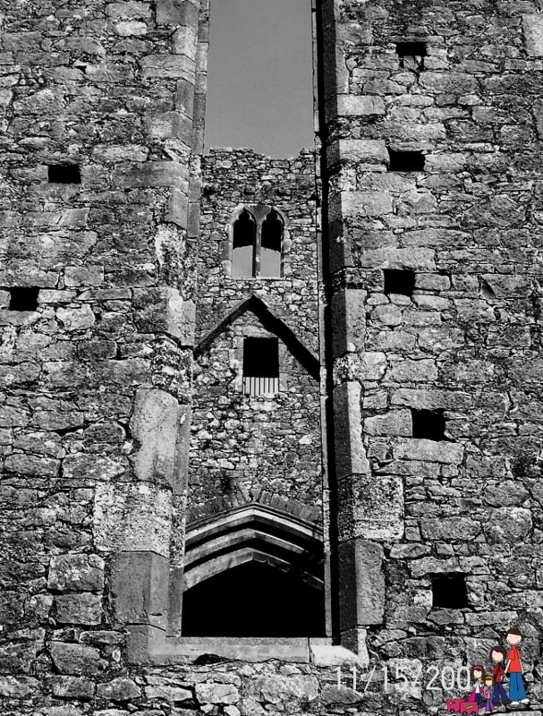
This is one of my favorite images from our time at the Rock of Cashel. But I can never decide if I like it in full color or black & white better…

I love the full color version because is shows the brilliant blue sky (it was late November and the weather was incredible), the colors and textures of the stones. I still use this image on my business cards as it feels timeless and somehow eternal.

The black & white I love because of the depth. The shadows play a bit more in the stone and it leaves me in awe of the men who built this castle of stone.
For more terrific travel photos visit Photo Friday hosted by Delicious Baby.


Wow, fabulous photo!!
I love B&W. It looks classic and timeless. 🙂
It’s hard to choose as I like them both for different reasons. That’s a pretty tough spot to be in, huh?!
I like the one in color better. to me the colors suggest both depth and history. I can see why the b&w version would be a good choice for your business card though, especially as it allows that little bit of color to emphasize the kids.
I think I like the black and white. Gives it a solid, ancient feel. Looks kind of brooding and mysterious.
I can see why you can’t decide. Both are fantastic in their own right! I think I like the color better only because the highlights pop out a bit more and you can really see the texture of the stones. If you popped out the whites in the B/W it would give the image even more depth and separate the highlights, midtones and shadows a lot more in the details. Then again, I love contrasty images and it could just me my monitor. Thanks for sharing your beautiful image!